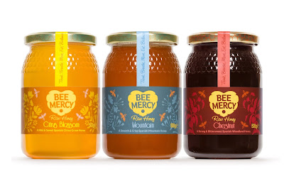
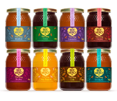
They came to us with a generic label across all their amazingly different tasting honeys, which really didn't do enough to communicate the care, passion and love they have for the product or the naturalness, benefits and personality of the brand.
(click to enlarge)


The identity Bright Green Brands created is pretty self explanatory - a beehive in the shape of a heart, showing the love we have for the bees, and the love (I like to think) the bees show by sharing their lovely food with us!
For the labels we illustrated the different plants the bees visited for each variety, from ground-growing meadow flowers like Heather, Thyme and Lavender, to the much taller Citrus groves, Eucalyptus, Oak and Chestnut trees, plus the less specific Forest and Mountain honeys.
As luck would have it I had just started a beekeeping course before the project came along, which was the best research I could possibly have imagined! Photos from that course to follow soon...


