Wednesday 20 November 2013

LATEST NEWS: Duke of Delhi Chocolate Bar Range Launched...


OK, so Duke of Delhi had already created a Bombay mix with chocolate chunks, an Indian snack with an eccentric British twist, which has become very popular, and now sold at Fortnum & Mason.
However, not happy to leave it there, they had a thought - what if we add more chocolate? a LOT more! So they turned it on it's head and came up with the Duke of Delhi Chocolate bar, with Bombay mix inside, a kind of Anglo-Indian Willy Wonka Bar!
There are five amazing flavoured chocolate varieties: Cardamom & Vanilla, Toasted Coconut, Lime, Orange and Cinnamon,  plus a plain version. Some are dark, some are milk, ALL are very different and a tad addictive!
They were launched this weekend at the BBC Good Food Show, Olympia.

Here's the packs we designed for them... (click to enlarge)


(Look out for the new website also launching any time now)


Thursday 24 October 2013

Stamping my Hart with a Squash!

When invited to help with my local Transition Town steering group, the first thing I couldn't help but do was redesign the identity.

The Transition movement is a network of worldwide local organisations trying to make their local area less dependent on oil and fossil fuels, more self sufficient, and try to tackle the problem of climate change, all from a local standpoint, the idea being that if every City, Town, Village and community did this then the collective effect worldwide would be huge.

Hertford originally got it's name for being the 'ford' where 'Harts' (stags) came to cross the water, and the 'Hart' has become a symbol of the town.

The idea for the identity was to visually suggest different people and local communities coming together to move the town forward, combining into the head of the (forward moving) stag. I also wanted to symbolise the local countryside surrounding the town.

Although there are no restrictions or guidelines as to how each Transition group identity should look, I wanted to give it a hand crafted feel, so I decided to cut out all the individual elements from of a butternut squash, then hand print them. I then scanned them in and pieced it back together in illustrator.

...the rest of said squash of course was not wasted, and went to very good (and pretty tasty) use!

(click images to enlarge)


Next challenge - redesign the website.

http://www.transitionhertford.org.uk

Wednesday 23 October 2013

Having Problems with Gas?!!

We ship most of our (fossil) gas into the UK on huge container ships from Qatar...
http://www.greenpeace.org.uk/newsdesk/energy/data/where-do-we-get-our-gas
...which isn't cheap, OR particularly eco-friendly.

OK, so we don't want huge gas price rises, and we don't really want to Frack the very ground we walk on (and poison the very water we rely on). So, apart from using much less, what's the alternative?
It could be renewable Biomethane. Ecotricity and even the National Grid agree:
http://www.ecotricity.co.uk/our-green-energy/our-green-gas/why-green-gas
http://www.nationalgrid.com/corporate/About+Us/climate/press/020209.htm

...let's just hope our frack-friendly Government see the benefits too.

Wednesday 24 July 2013

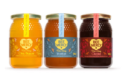
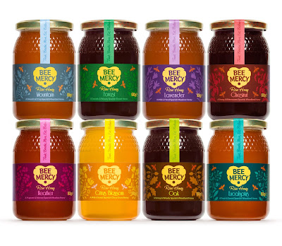
LATEST NEWS: Bee Mercy Raw Honey Rebrand...

Just shot the newly rebranded range of Bee Mercy Raw Honey, as natural a honey as you can get without raiding a wild beehive (which I do not advise).

They came to us with a generic label across all their amazingly different tasting honeys, which really didn't do enough to communicate the care, passion and love they have for the product or the naturalness, benefits and personality of the brand.

(click to enlarge)


The identity Bright Green Brands created is pretty self explanatory - a beehive in the shape of a heart, showing the love we have for the bees, and the love (I like to think) the bees show by sharing their lovely food with us!

For the labels we illustrated the different plants the bees visited for each variety, from ground-growing meadow flowers like Heather, Thyme and Lavender, to the much taller Citrus groves, Eucalyptus, Oak and Chestnut trees, plus the less specific Forest and Mountain honeys.

As luck would have it I had just started a beekeeping course before the project came along, which was the best research I could possibly have imagined! Photos from that course to follow soon...


Monday 24 June 2013

Gotta love that M&S packaging...

Just seen this 'Great British Summer' range in my local M&S, REALLY like the Summeryness and the quirky quintessential Britishness, plus it just LEAPS out on-shelf, appearing all round the store in various categories.

Instinctively picked up several packs of I-don't-even-KNOW-what, then realised how much I was spending on stuff I didn't 'need', but just 'wanted'. After all these years I STILL get totally suckered by my own profession!


Wednesday 8 May 2013

Waitrose Go with the Flow!

Fantastic news from Waitrose. They plan to replace ALL meat packaging with flow-wrap. Meat packaging is a HUGE waste, considering how many people across the country buy meat every day packaged in hard plastic trays. We, luckily, still have a local Butchers - no plastic packaging, free-range AND local.


Lets hope other retailers follow Waitrose lead, especially M&S, with their supposed 'plan A' - still seemed to be tonnes of plastic on the shelves last time I visited.

Thursday 28 March 2013

Beautiful, Magical & Surreal Garden Photography by Magda Wasiczek

Some absolutely astonishing photography, very inspiring . Might have to dust off my macro lens and get outdoors.
LOTS more on her website (a little TOO much maybe, could do with a little editing): http://www.magdawasiczek.pl/on_my_magic_meadow

She also won International Garden Photographer of the year: http://www.igpoty.com/competition05/winners.asp?parent=winners


(click images to enlarge)