We ship most of our (fossil) gas into the UK on huge container ships from Qatar...
http://www.greenpeace.org.uk/newsdesk/energy/data/where-do-we-get-our-gas
...which isn't cheap, OR particularly eco-friendly.
OK, so we don't want huge gas price rises, and we don't really want to Frack the very ground we walk on (and poison the very water we rely on). So, apart from using much less, what's the alternative?
It could be renewable Biomethane. Ecotricity and even the National Grid agree:
http://www.ecotricity.co.uk/our-green-energy/our-green-gas/why-green-gas
http://www.nationalgrid.com/corporate/About+Us/climate/press/020209.htm
...let's just hope our frack-friendly Government see the benefits too.

Wednesday, 23 October 2013
Wednesday, 24 July 2013
LATEST NEWS: Bee Mercy Raw Honey Rebrand...
Just shot the newly rebranded range of Bee Mercy Raw Honey, as natural a honey as you can get without raiding a wild beehive (which I do not advise).
They came to us with a generic label across all their amazingly different tasting honeys, which really didn't do enough to communicate the care, passion and love they have for the product or the naturalness, benefits and personality of the brand.
(click to enlarge)


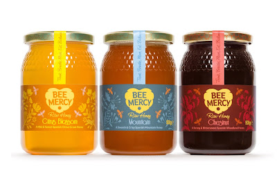

The identity Bright Green Brands created is pretty self explanatory - a beehive in the shape of a heart, showing the love we have for the bees, and the love (I like to think) the bees show by sharing their lovely food with us!
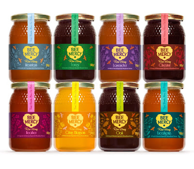
For the labels we illustrated the different plants the bees visited for each variety, from ground-growing meadow flowers like Heather, Thyme and Lavender, to the much taller Citrus groves, Eucalyptus, Oak and Chestnut trees, plus the less specific Forest and Mountain honeys.
As luck would have it I had just started a beekeeping course before the project came along, which was the best research I could possibly have imagined! Photos from that course to follow soon...
They came to us with a generic label across all their amazingly different tasting honeys, which really didn't do enough to communicate the care, passion and love they have for the product or the naturalness, benefits and personality of the brand.
(click to enlarge)


The identity Bright Green Brands created is pretty self explanatory - a beehive in the shape of a heart, showing the love we have for the bees, and the love (I like to think) the bees show by sharing their lovely food with us!
For the labels we illustrated the different plants the bees visited for each variety, from ground-growing meadow flowers like Heather, Thyme and Lavender, to the much taller Citrus groves, Eucalyptus, Oak and Chestnut trees, plus the less specific Forest and Mountain honeys.
As luck would have it I had just started a beekeeping course before the project came along, which was the best research I could possibly have imagined! Photos from that course to follow soon...
Monday, 24 June 2013
Gotta love that M&S packaging...
Instinctively picked up several packs of I-don't-even-KNOW-what, then realised how much I was spending on stuff I didn't 'need', but just 'wanted'. After all these years I STILL get totally suckered by my own profession!


Wednesday, 8 May 2013
Waitrose Go with the Flow!
Fantastic news from Waitrose. They plan to replace ALL meat packaging with flow-wrap. Meat packaging is a HUGE waste, considering how many people across the country buy meat every day packaged in hard plastic trays. We, luckily, still have a local Butchers - no plastic packaging, free-range AND local.
Lets hope other retailers follow Waitrose lead, especially M&S, with their supposed 'plan A' - still seemed to be tonnes of plastic on the shelves last time I visited.
Thursday, 28 March 2013
Beautiful, Magical & Surreal Garden Photography by Magda Wasiczek
Some absolutely astonishing photography, very inspiring . Might have to dust off my macro lens and get outdoors.
LOTS more on her website (a little TOO much maybe, could do with a little editing): http://www.magdawasiczek.pl/on_my_magic_meadow
She also won International Garden Photographer of the year: http://www.igpoty.com/competition05/winners.asp?parent=winners


Wednesday, 7 November 2012
Duke of Delhi on sale at Fortnum & Mason
Over the last year or so I've been working on the rebranding of Duke of Delhi, a fantastic range of Indian inspired snacks.
The Client came to Bright Green Brands with a range of biscuits, and with the name Duke of Delhi, though admitted that the current design wouldn't get him taken seriously by the kind of retailers he was aiming to approach - high end outlets such as Harvey Nichols, Selfridges and Fortnum & Mason.
I instantly fell in love with the name (as well as the biscuits) and saw great potential to help create a unique and distinctive brand.
While pondering on the new identity I wondered who the Duke of Delhi might be: Was he an Englishman in India, or an Indian in England? And how would he travel?
After deciding a horse-drawn royal carriage if in Britain and a royal elephant in India, I decided to put the two together, mixing the eccentricities of both cultures in one simple logo.

The identity was then applied to brightly printed card headers, plus we found a supplier of cellophane bags, a transparent and biodegradable alternative to plastic film.

After the initial rebrand of the biscuit packs, the client wanted to launch a new product - a Delhi Mix (think Bombay mix with a quirky flavour twist), packaged in 'tiffin-style' tins.
Well the good news is that Fortnum & Mason want to stock the Delhi Mix, and is on shelf this week! Very proud to see it go into just about the poshest shop there is!!


All in all a lovely job for a lovely client who appreciates and understands how design can help get you where you where you want to go.

Monday, 15 October 2012
Can You Own a Colour?
For my final project at university I asked Pearlfisher (where I was on student placement) to write me a design brief.
They asked me to package Coca Cola for 15 years in the future.
It was a great brief, and I came up with loads of ideas, based on what I believed could happen in the not too distant future.
Back at the end of the last century (was it THAT long ago I was at uni?!!), water shortage was only just becoming a recognised potential global problem, so one idea was to design a concentrated Coca Cola, packaged only in the bottom of a cut-off bottle-shaped can, which you then have to dilute yourself (if you can find water!)
Genetically modifying food was also a new development, so another idea was that Coca Cola would genetically engineer their own fruit, to look like an orange (but red of course) with cola coloured segments that tasted of Coca Cola.
Next was Global warming - such a nuisance when you want a nice cold can of your favourite sugar-based global-domineering soda. The solution? a solar-panelled can that generates energy to cool the contents of course!
OK, so 15 years have passed and none of these have gone into production (thankfully).
However, another idea I had was that Coca Cola would own the rights to the colour red! so no red tomatoes allowed, and no red flowers, ladybirds, buses, post boxes, lipstick, clothes... so the only time you ever saw red it HAD to mean Coca Cola.
For the pack I didn't even need a logo, it was simply a red can with an ® symbol in the corner.
Then I saw this slightly disconcerting story in Design Week yesterday:
http://www.designweek.co.uk/news/cadbury-wins-exclusive-use-of-pantone-2685c-purple/3035336.article
The future it seems may well be orange, but only for Orange™. Surely brand legal departments the world over are now hastily applying for ownership of their particular Pantone colour?
Restricting times ahead for us brand designers I think.
UPDATE: The Nestlé Empire Strikes Back! (thankfully) http://www.designweek.co.uk/news/cadbury-loses-legal-fight-over-rights-to-pantone-2685c-purple/3037307.article?cmptype=Exxon%20and%20FXX%20in%20legal%20row%20over%20interlocking%20Xs,%20Cadbury%20loses%20Pantone%202685c%20purple%20fight,%20Children's%20Illustrated%20Classics%20at%20the%20British%20Library%20and%20more...&cmpid=dwnews_14902


Subscribe to:
Posts (Atom)